My Top Grey Paint Colours Explained
- Karolina De Costa
- Sep 23, 2018
- 4 min read
Updated: Aug 22, 2023
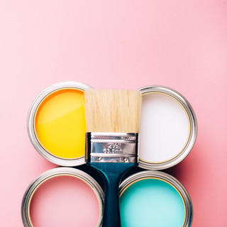
It’s no secret grey is my favourite colour. The walls in our house our grey, I am sitting on a grey blanket and I’m wearing a grey shirt. It’s contemporary, goes with anything and looks great in any room. But picking the perfect grey paint colour for the walls can be tough – especially with so many choices. That’s why I’m making a list of my favourite shades below with a quick description of each!
The reason why grey walls are so tough to get right is that there are so many undertones. Some greys are cooler with a blue or violet undertone while others can be warmer with a beige or green undertone (my husband hates the work “geige” but it works here). Which one is perfect for your space depends on the other elements in your design (furniture, flooring, counters, art, etc.) as well as the lighting so scroll through my top picks below to see which ones might work well for you.
Let’s start with the cooler colours – ones that have a blue undertone. They will work well in modern spaces and can also be great for making small rooms feel more open and breezy. Remember, paint colours on the wall will look darker than on a paint swatch so I’m going to start with the lightest one and work my way down. Also, the chips below will look different on your computer or phone than in real life so always double check the colour before making a final decision.
I love Benjamin Moore Distant Gray because it’s barely there so it’s perfect in spaces where you want to use the same colour on the walls and on the ceiling. This is a handy trick if you want a small space (or a space with weird angles and ceiling lines) to feel bigger. You might not even notice that it’s a colour really but it’s just off white enough.


Another great cool shade is Benjamin Moore Chalk White. Definitely more blue in this one so it’s great for bathrooms, laundry rooms, hallways and any other space you want to feel crisp and clean. Because it has a tiny bit more colour than Distant Grey you will see a contrast with white trim, doors and ceilings.


In some lights Benjamin Tundra can look almost violet. That’s why I love it in a nursery or bedroom. It works beautifully with cool metals like silver and with woods like walnut.


We are warming up a bit but we’re still not in the “greige” category. Genesis White and the darker Whitestone are my favourite greys when you’re looking for something cool that’s not blue. Whitestone looks great in larger spaces with a lot of light and will contrast beautifully with white trim and doors.


Looking for a great grey that won’t feel too dark and cold in small spaces without a lot of light? A few years ago we painted Benjamin Moore Paper White on the walls in our apartment. It’s partially below grade so the light isn’t great and the rooms aren’t big but it looks clean, fresh and contemporary without making the space feel gloomy and dark. It’s definitely one of my top picks for all over interiors (the swatch below doesn’t do it justice)!


And of course you can’t talk about grey without mentioning Stonington Gray (currently on the walls in our entry and laundry room) and Coventry Gray. They are both very neutral – not too cool and not too warm – and would like great in the living room, bedroom and kitchen. Because Coventry Gray can look quite dark it also makes a great accent wall colour!


It’s getting warmer! The next few colours have beige undertones and will feel more traditional (without being dated). My go-to colour is Benjamin Moore Sea Pearl because it’s great for all-over interiors, will work with any design plus it has just enough colour to stand out against white trim and doors without making rooms feel too small.


If your rooms are larger with more light try Benjamin Moore Edgecomb Gray. It’s perfect when you want to create a warm atmosphere in bedrooms, living rooms and nurseries. You will definitely see more “beige” less grey in this one.


No conversation about grey would be complete with Gray Owl. Surprisingly when you put it up against other greys it almost looks green – which it is! Because it’s warm and earthy it’s beautiful with any wood plus looks cozy in any room. You can’t go wrong with this one.


Have you tried any of the colours below? Which one is your favourite? Leave me a comment below!
Need a little help picking the right paint color for your space? See how my virtual color consulting service can help. Click here to learn more.
Painting at home? Don't visit the paint shop without downloading my Inside The Paint Can e-guide. It's filled with over twenty pages of tips and tricks, paint suggestions and more! Learn more below.


Comments